So I will be honest. Creating covers for Mazebook was a lot harder than I thought it would be. Actually, I may have had a harder time doing the covers for this book than any other I’ve done. And that’s a bit ironic considering how easily the interior artwork came for this book. Whenever I thought about the covers, I just sort of shrugged it off thinking, “I’ll do something cool and graphic with the mazes”. I thought the visual strength of the mazes themselves would lend themselves to endless possibilities. But then when I sat down to actually come up with the covers I really struggled to find something that lived up to these ambitions.
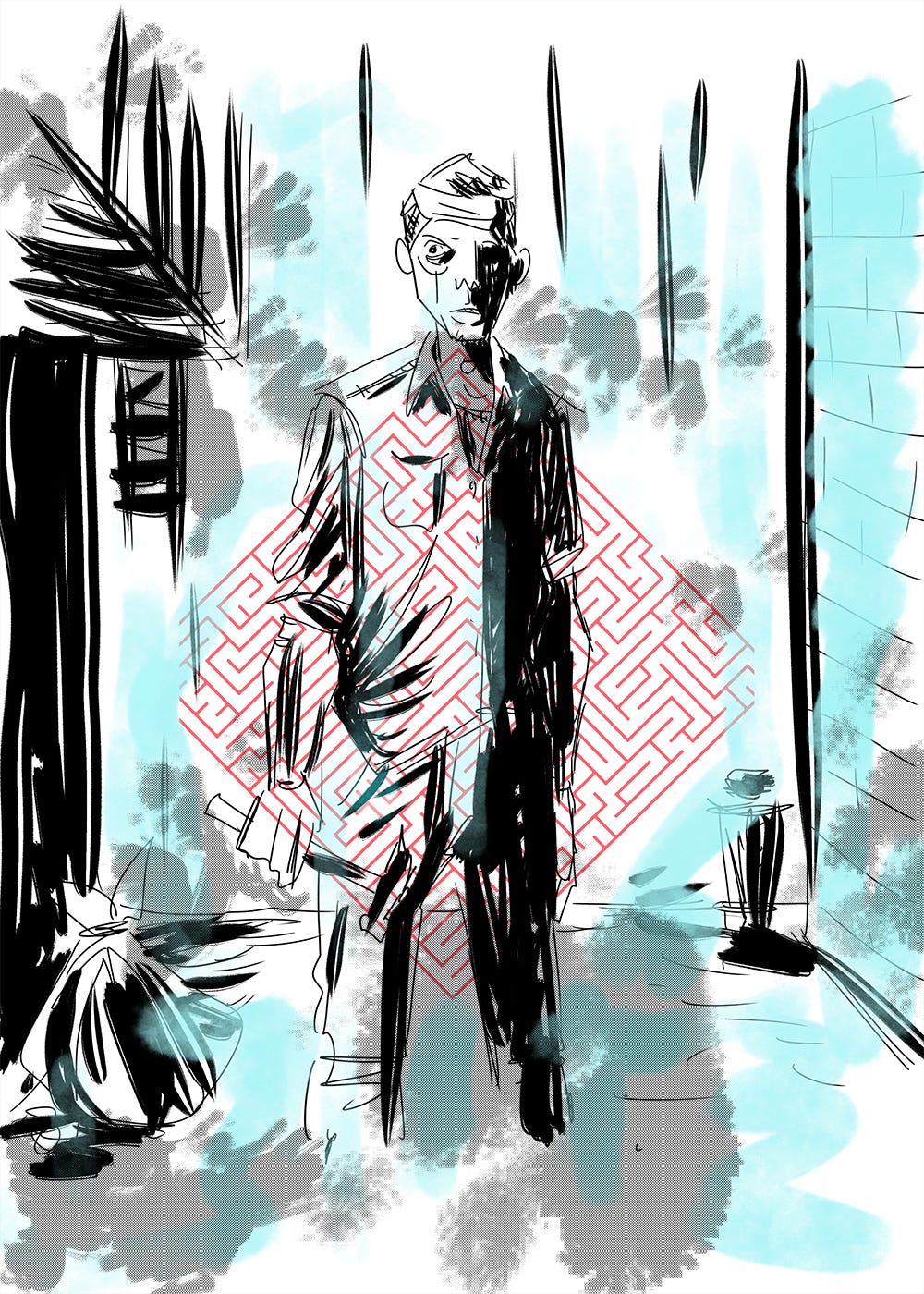
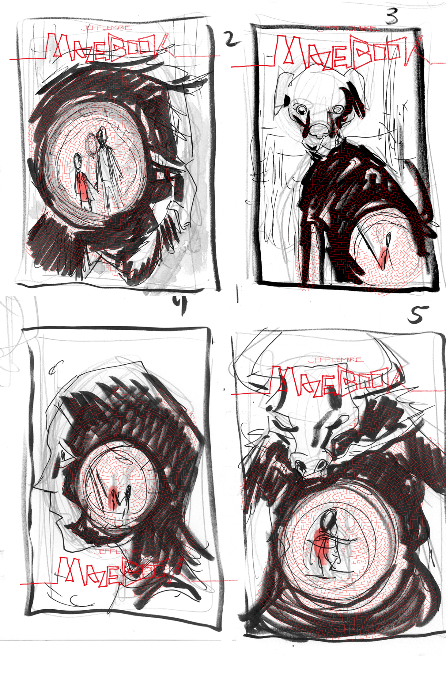
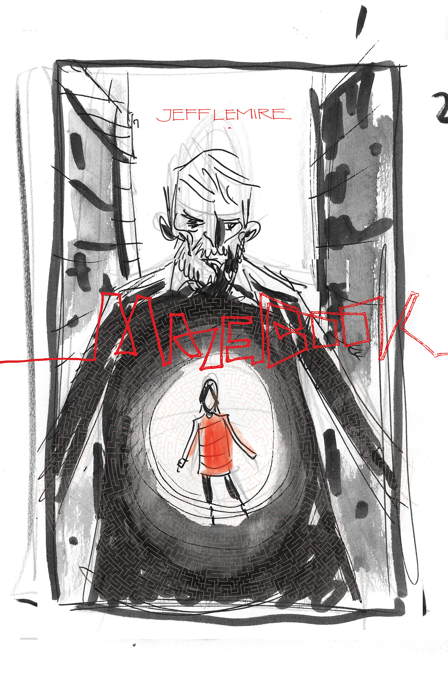
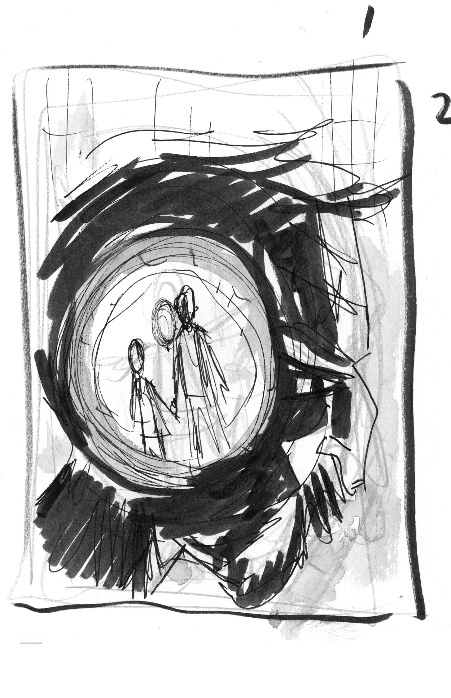
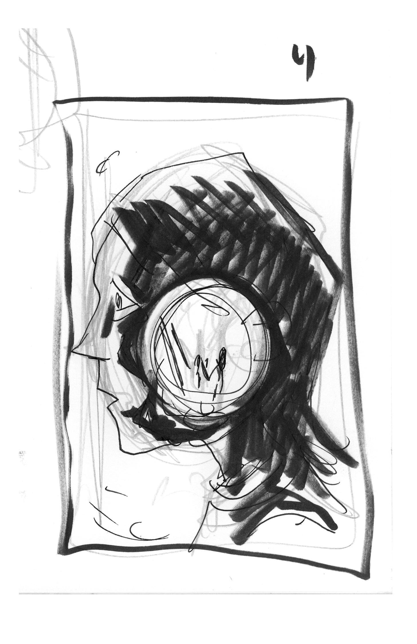
As you can see many of my early sketches had an image of Will with the maze sort of imposed over him. In theory, and in these rough sketches, it worked for me. And at the time I love the energy and spontaneity of a lot of these sketches.
But trying to execute these sketches as finished covers always resulted in images that felt too busy. The eye couldn’t focus on any one element.
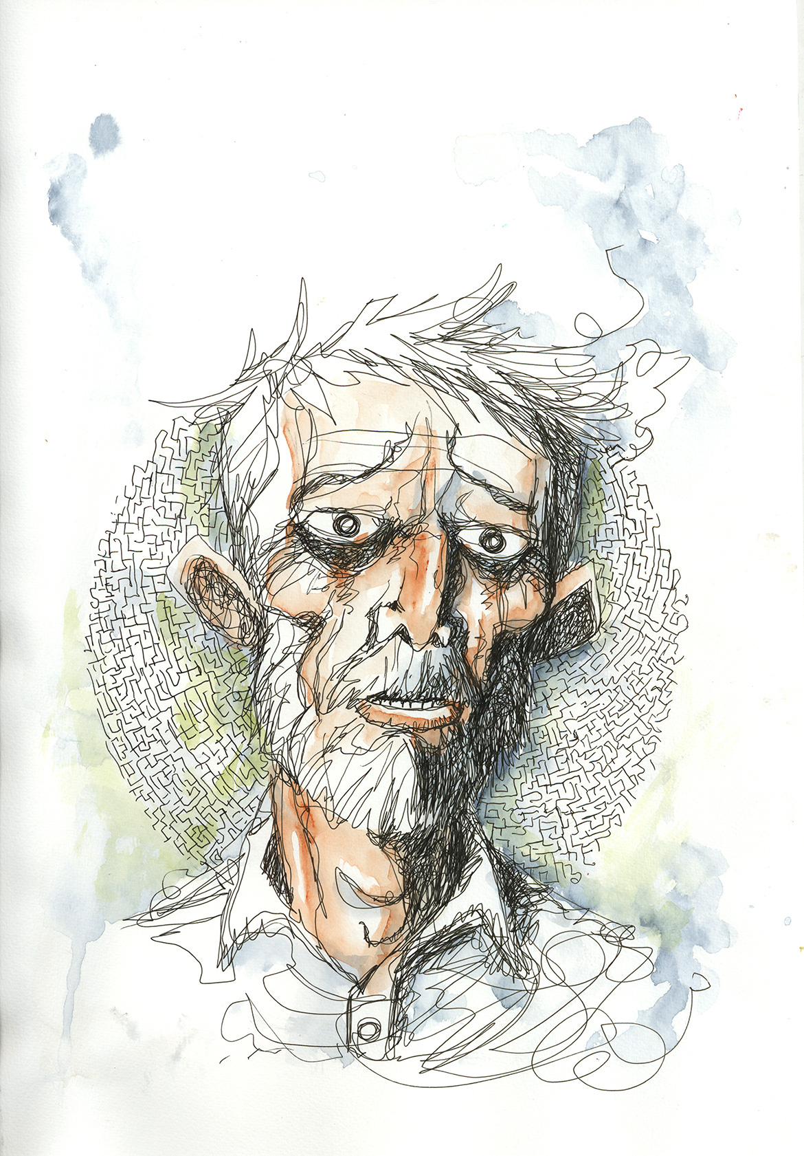
So then I tried some other approaches. One idea was to do these line drawings where the maze itself sort of made up these thin lines like the string going through the maze. This was inspired by artist Greg Ruth’s incredible “recursive drawings”. If you don’t know Greg’s work, you need to check his out. He is UNREAL. And I learned really quickly that I ain’t no Greg Ruth.
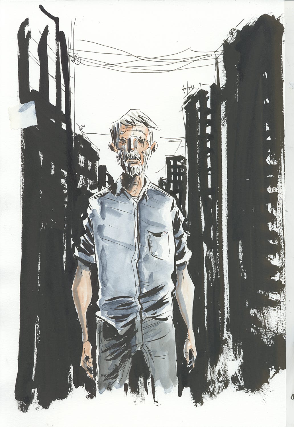
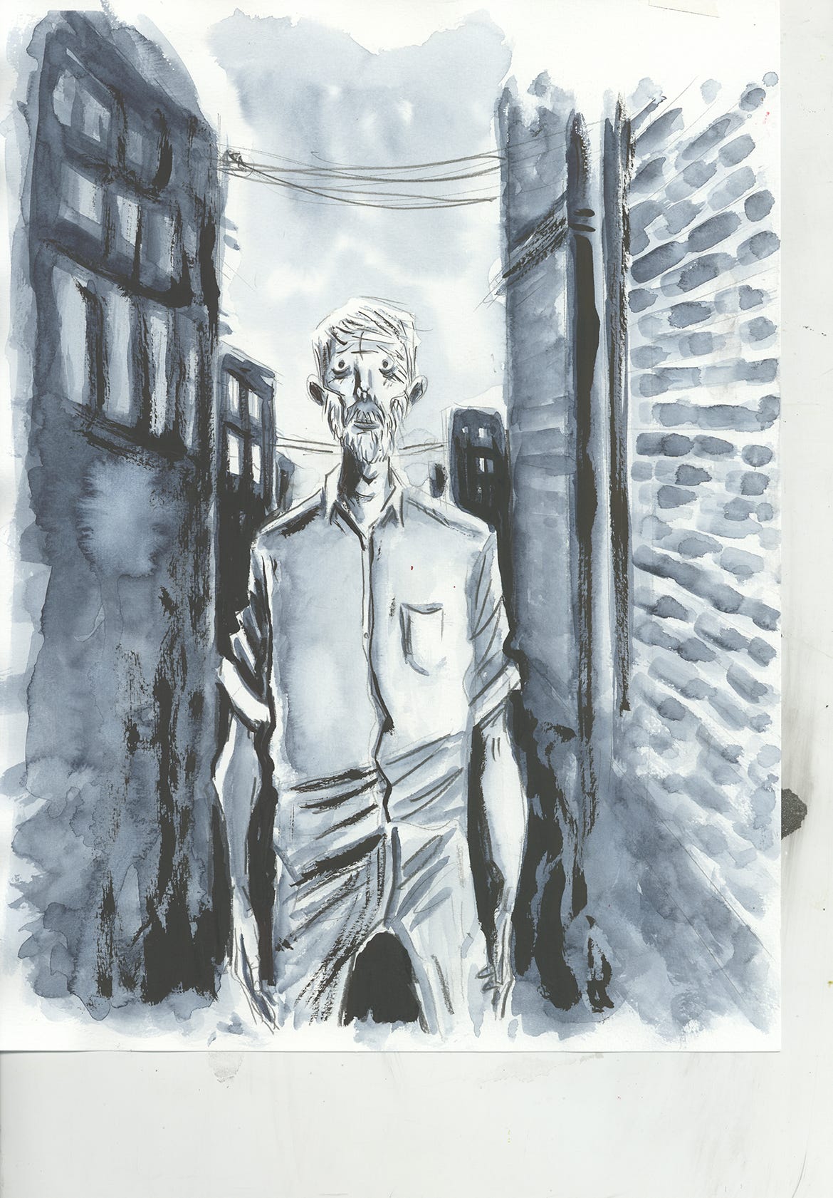
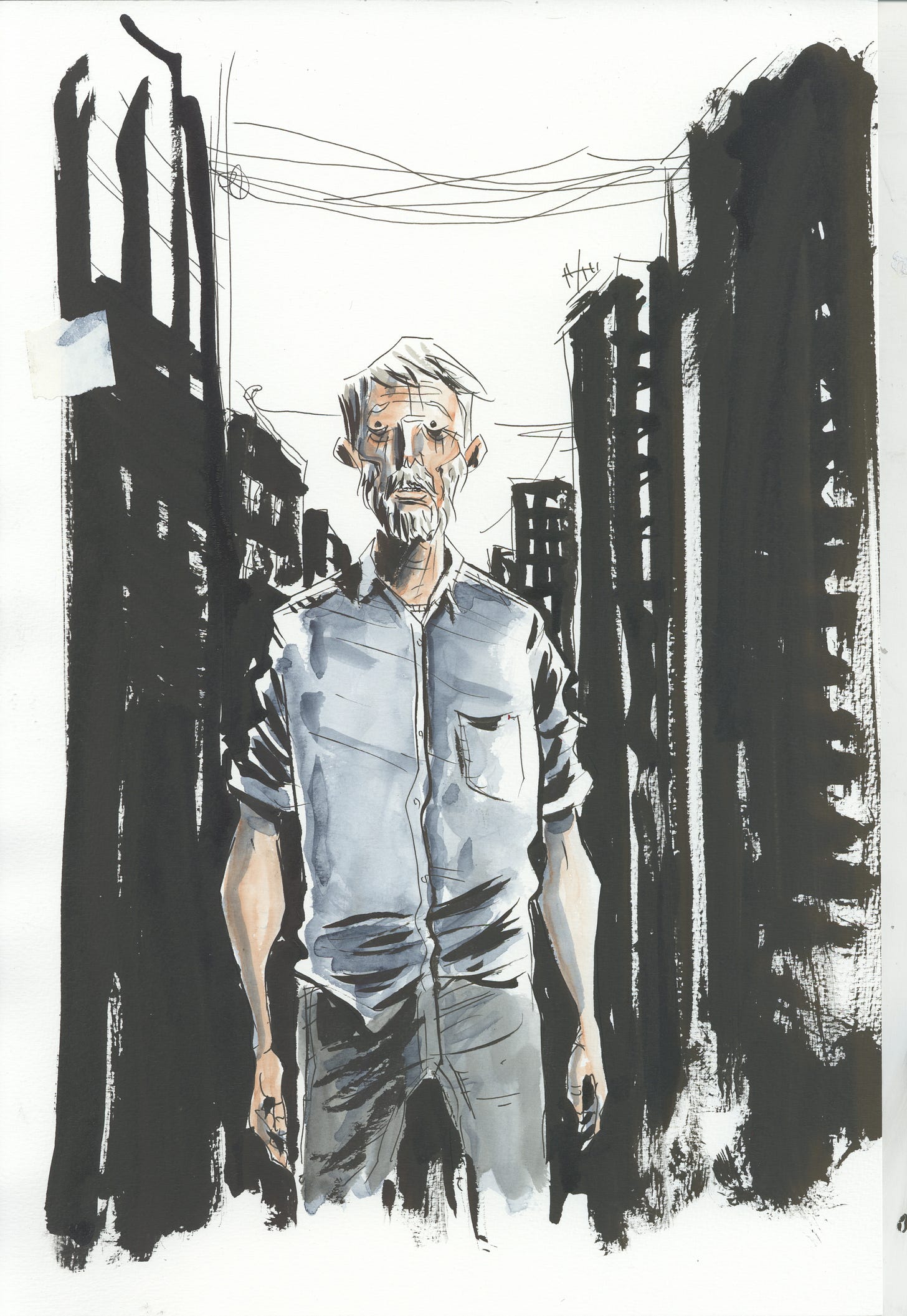
The frustration of this idea led to the next attempts. I thought I needed to employ more blacks in order to create enough negative space to let the busy shape of the maze exist.
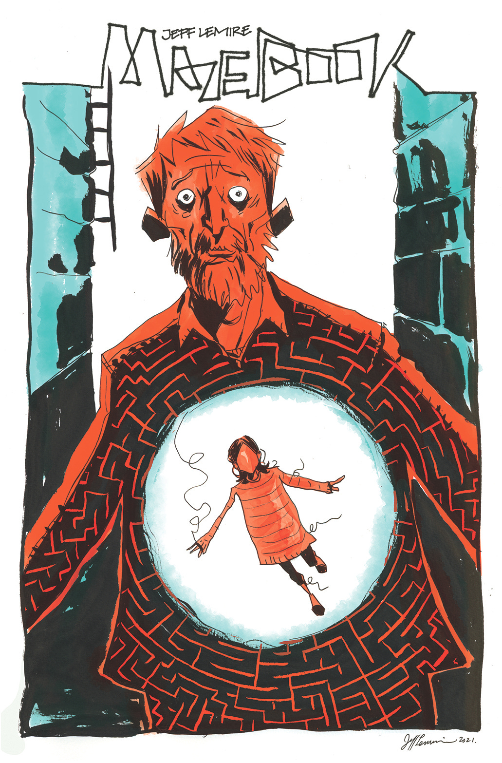
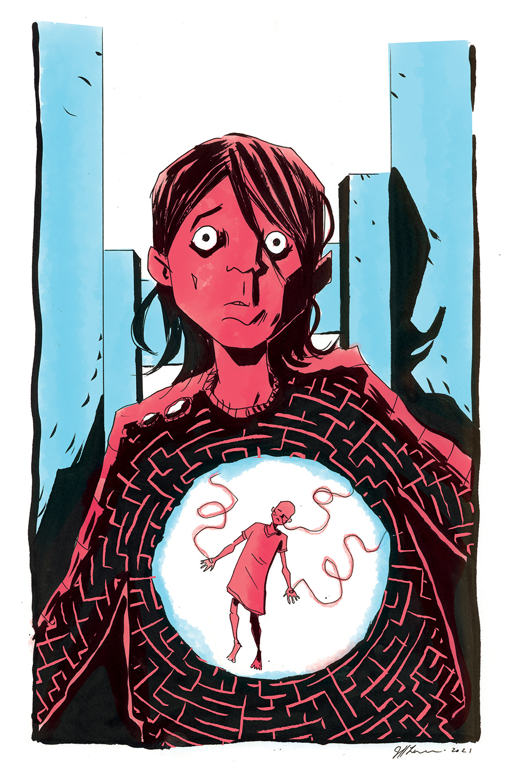
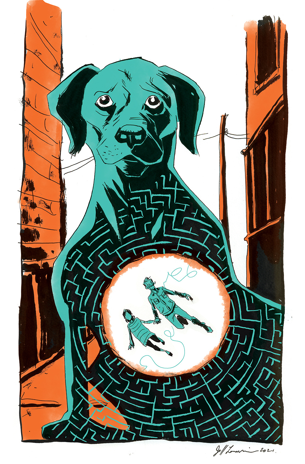
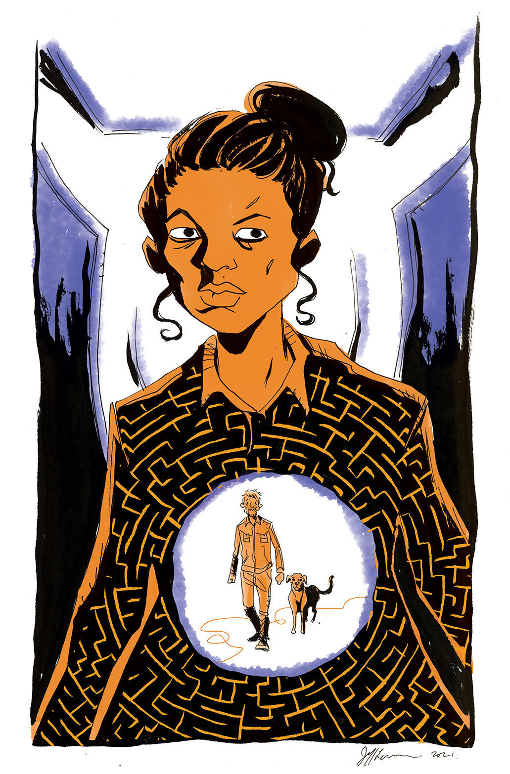
This concept is actually really close to the final covers, it was just a totally different way of executing it. Here I tried lots of black with full color done in watercolor. In hindsight, these covers sort of work for me. I could have gone with them and probably been satisfied.
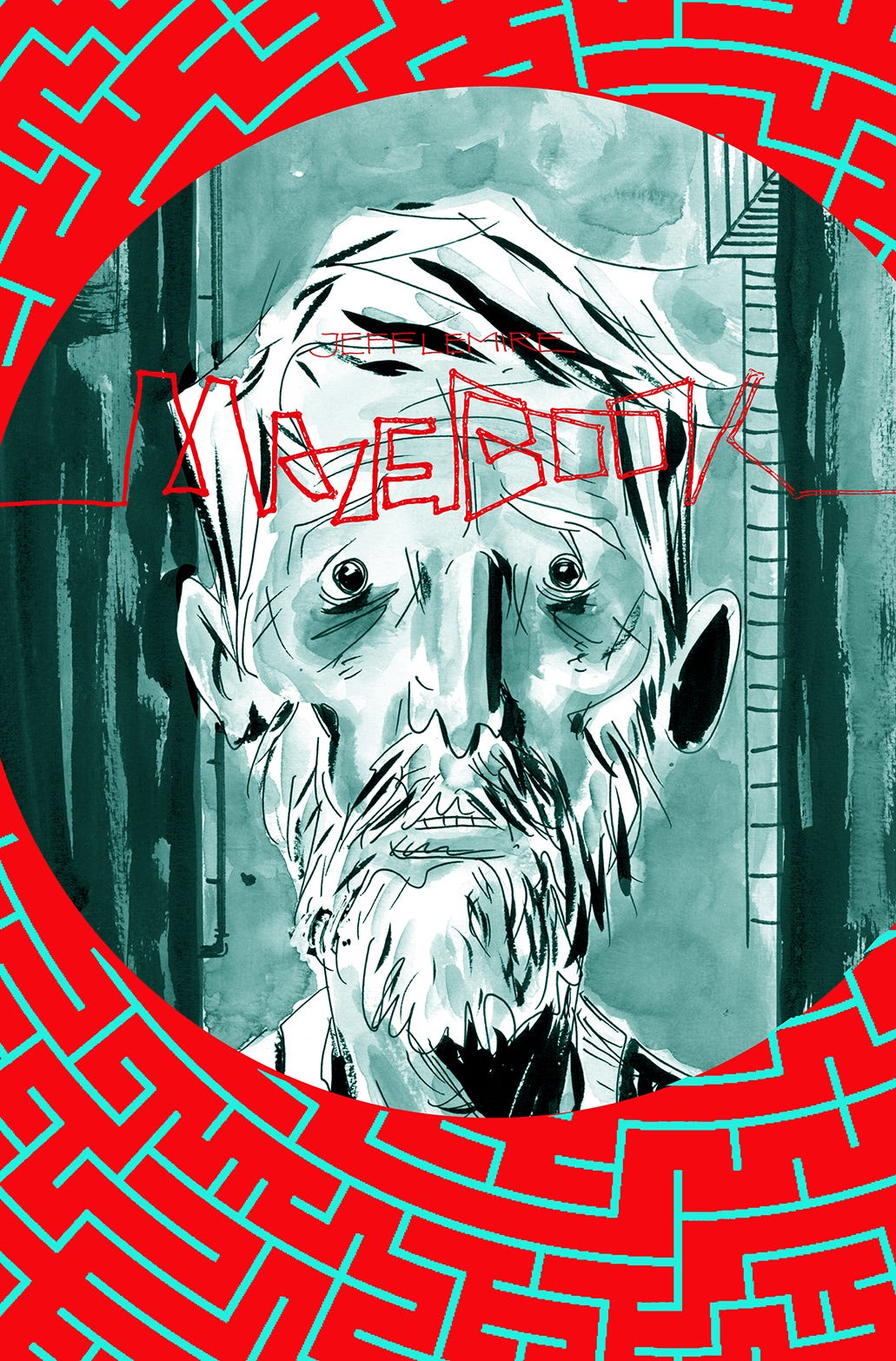
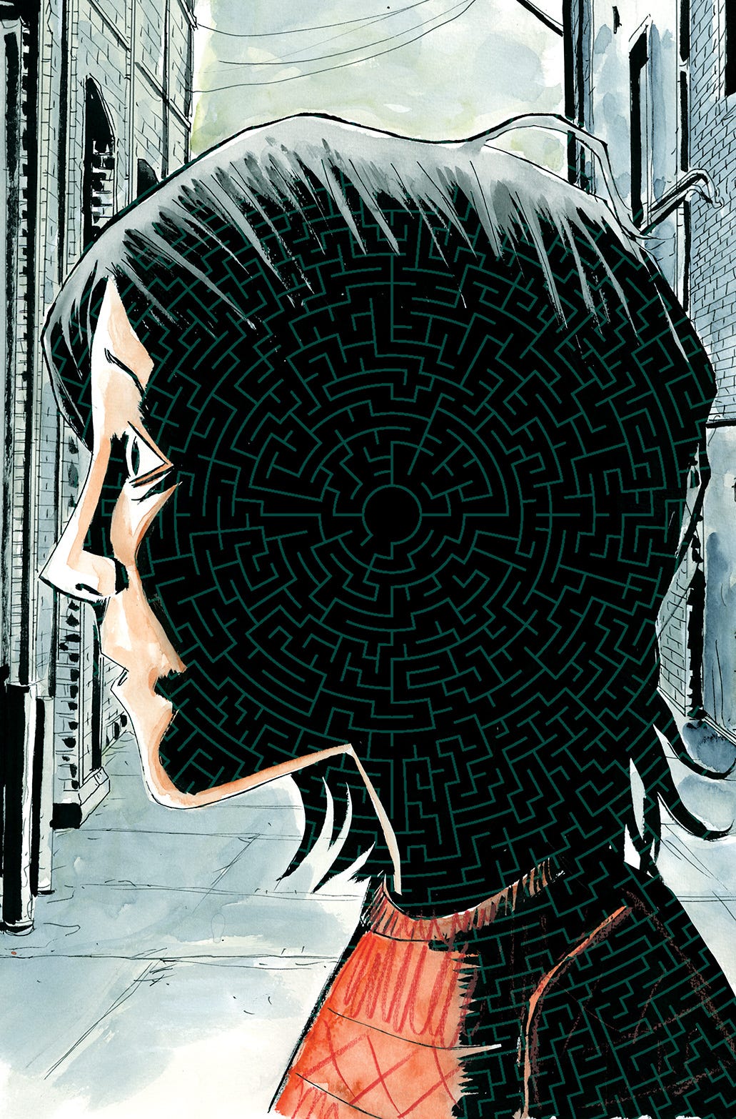
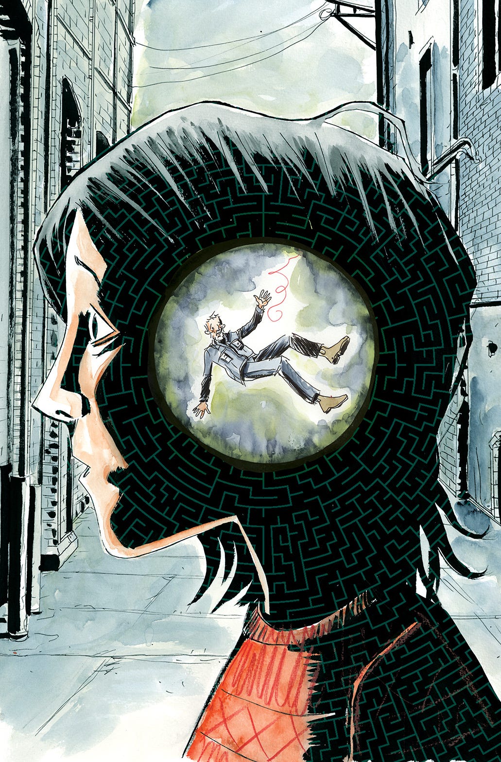
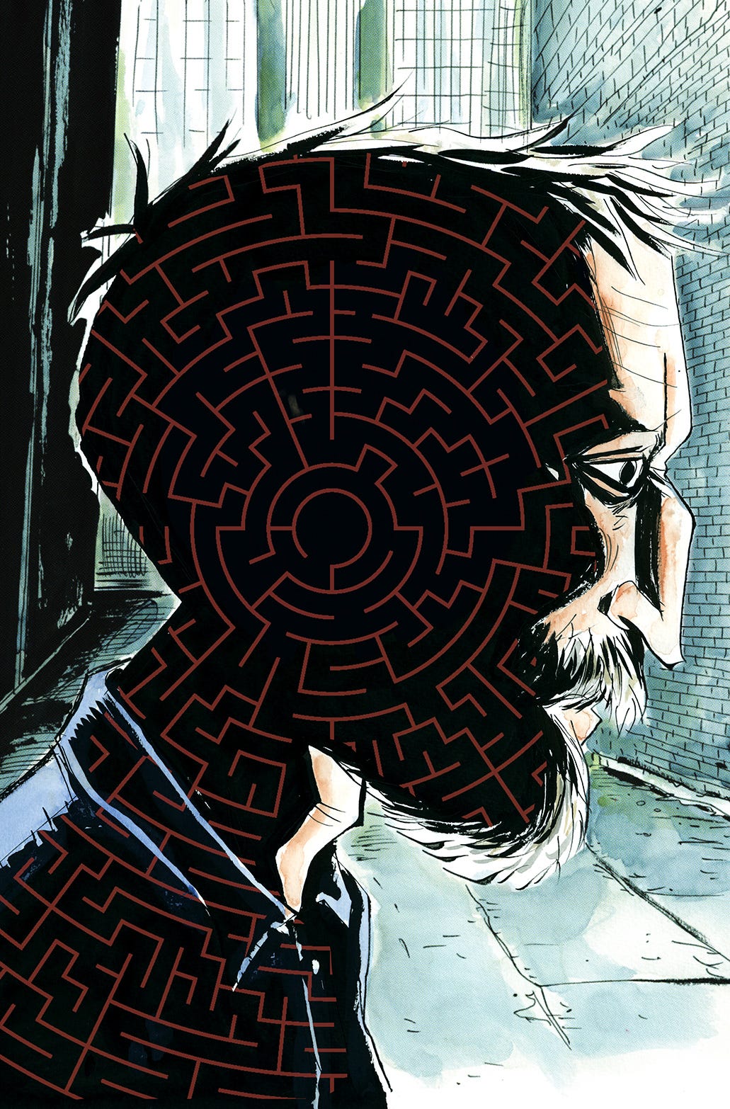
But I’m glad I didn’t settle, because this led to the breakthrough that ended up being the final covers. And that breakthrough was…stealing! Art is imitation and in this case I stole from the best, Michael Cho.
I was at my wits end trying to get these covers to work. And I was literally sitting in my studio staring at the original art for this Black Hammer cover that Michael Cho did for me. I love his work and I absolutely love this cover. And it just hit me, what If I tried this color approach.
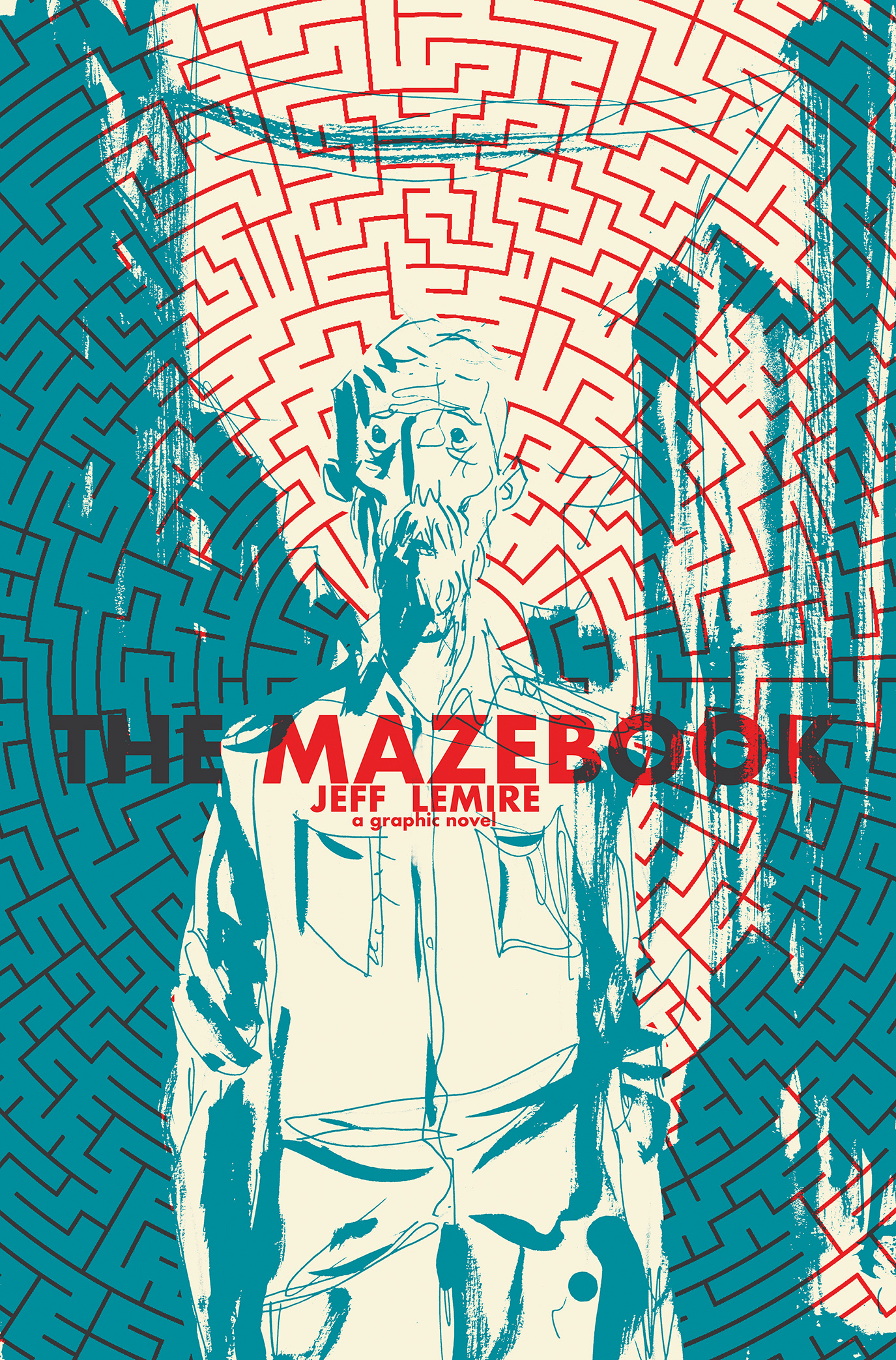
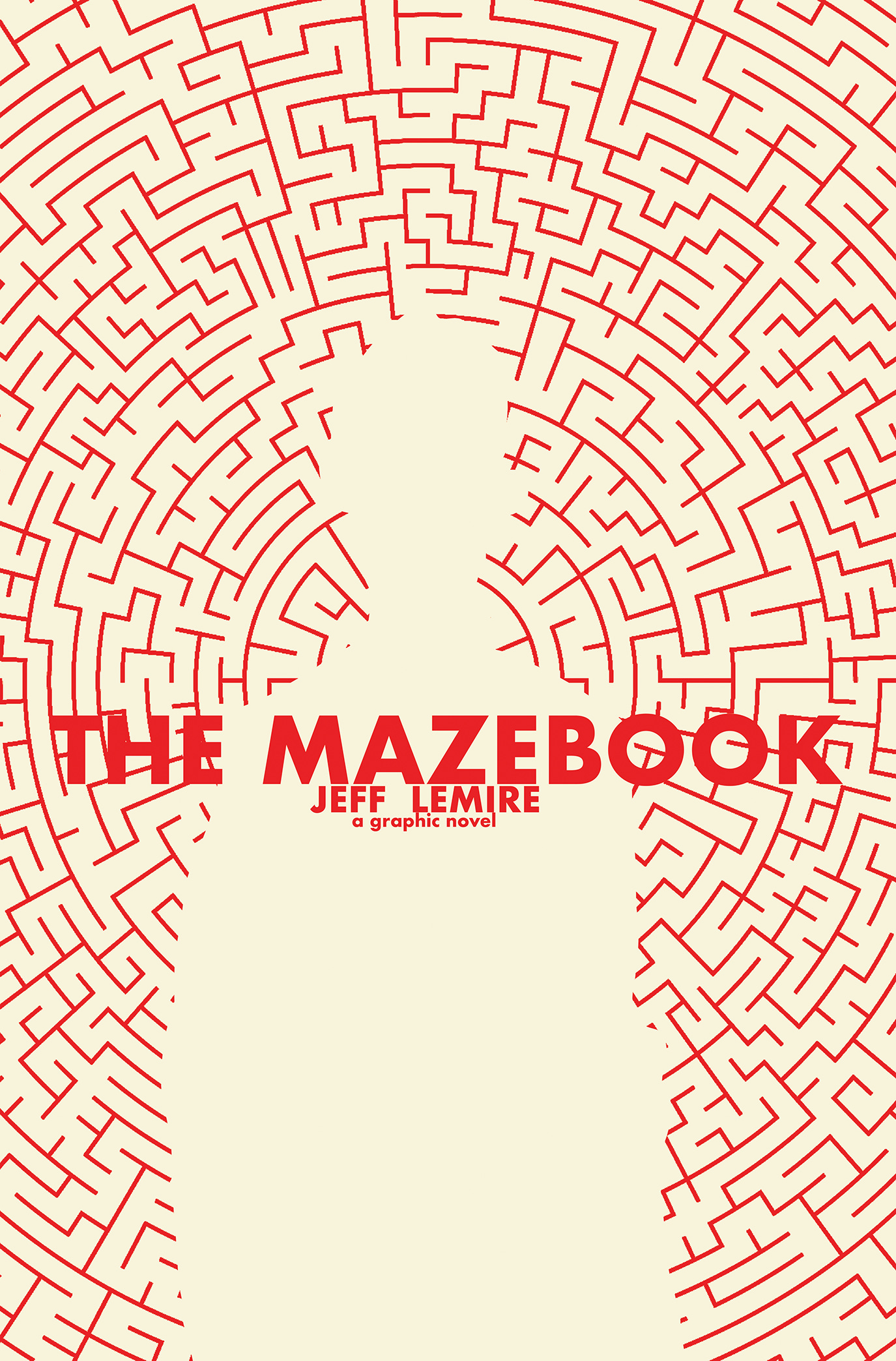
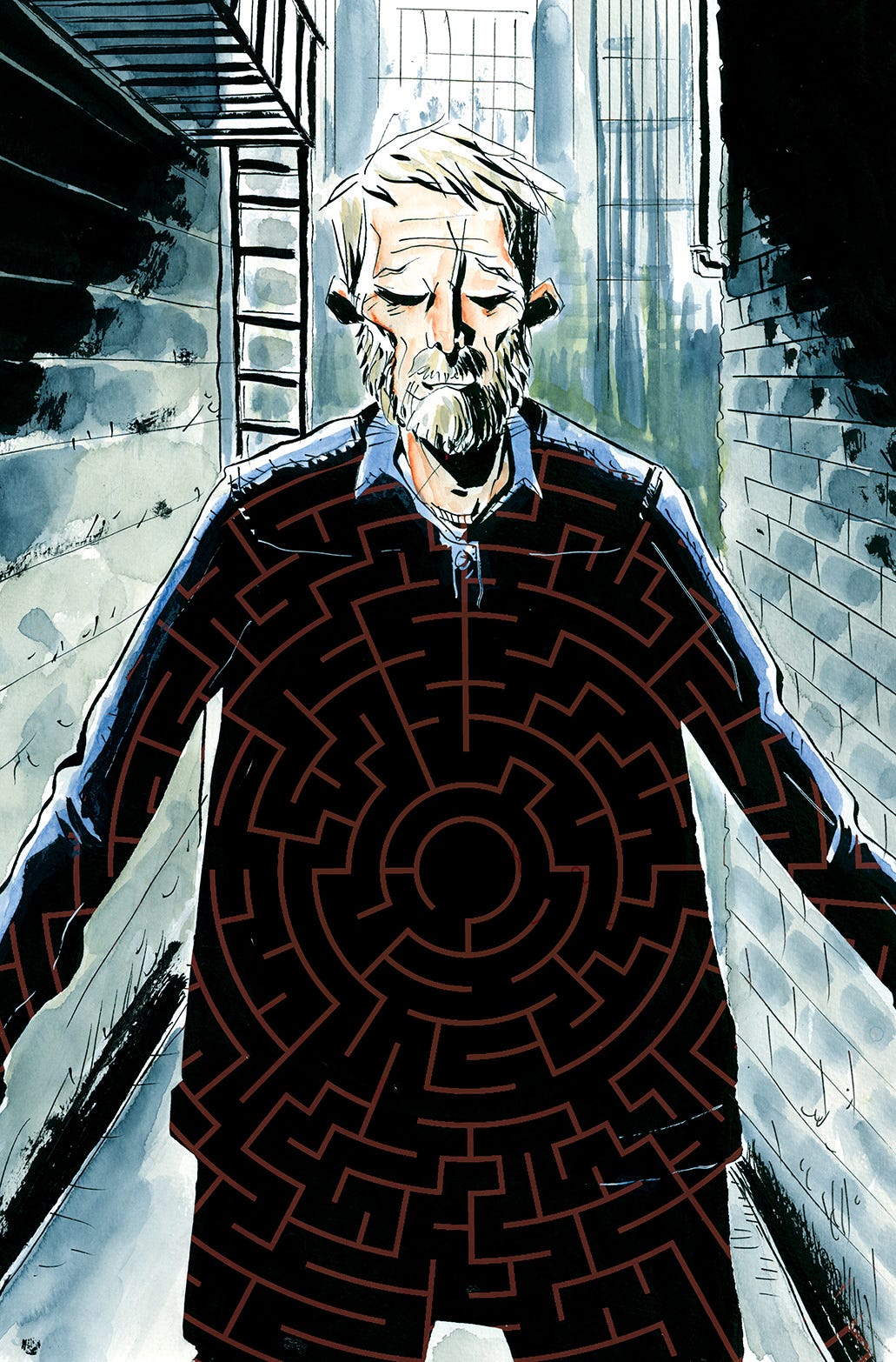
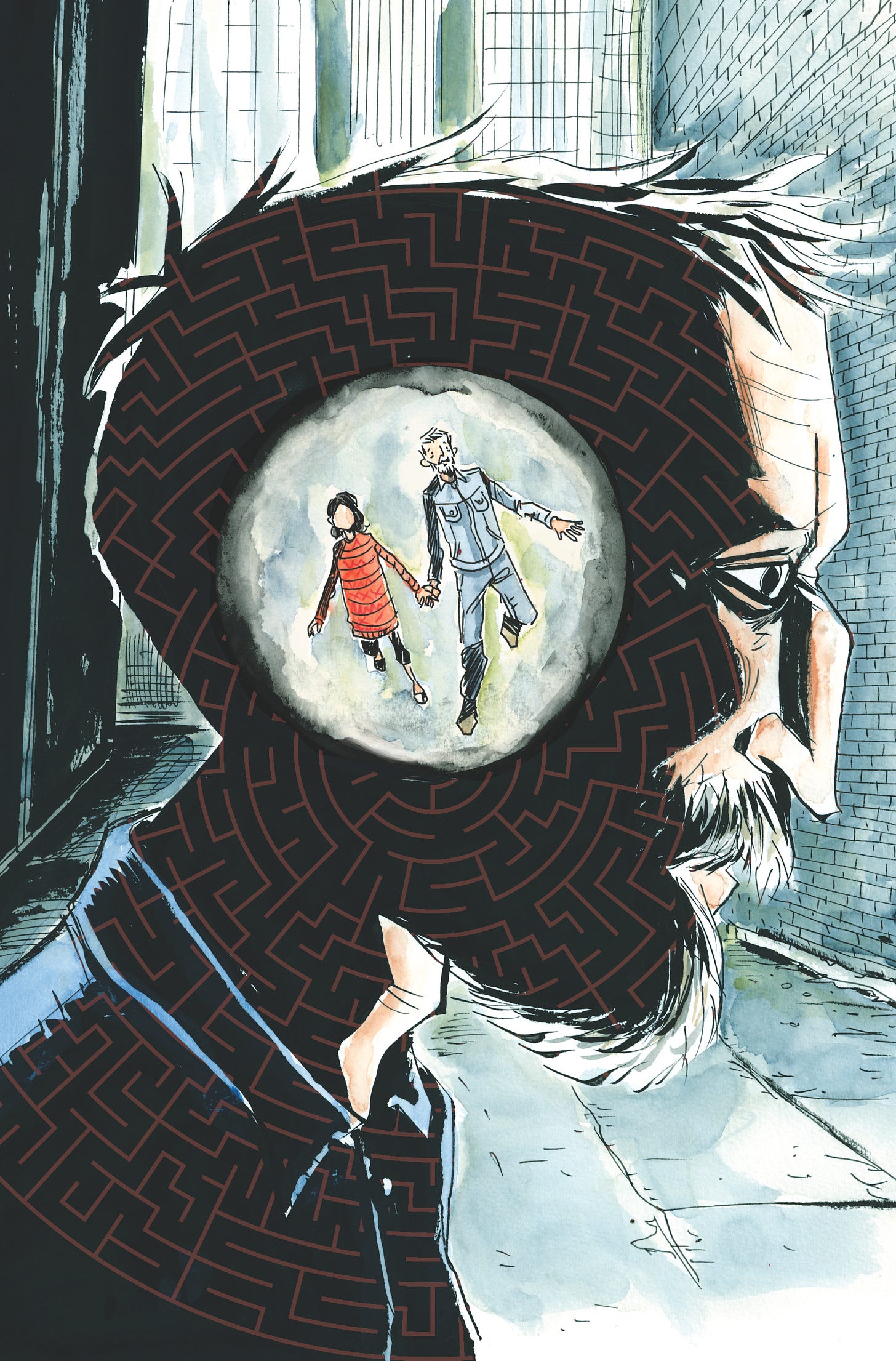
This was really different than how I would normally approach my art and my color. But seeing Michael’s work and how he uses color really inspired me to try it myself and the results just popped. I inked them traditionally and then played with the different colors in photoshop. The covers popped. They were really striking and had all the elements in them I wanted and suddenly they weren’t competing with each other but rather working together in one cohesive image.
So, thank you Michael Cho for inspiring the Mazebook covers!!
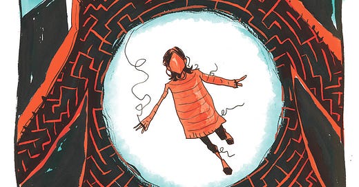
The last element, and the one that really tied it all together was the logo design by Tom Muller. I loved working with Tom in the past and was looking for another opportunity. Tom did a few different looks for me and we locked in on the hand-drawn “string” logo really quickly. And the bold graphic approach to the art let the thin, delicate logo breathe.
Here’s Tom to give a little backstory and commentary on these designs…..
When Jeff got in touch somewhere last year and asked if I was interested to design the logo and overall publication design for MAZEBOOK it was a bit of a no-brainer for me. I’m a big fan of his work, and over the years we’ve kept in touch to to see if there was a project we could work on ever since I designed the logo for his amazing TRILLIUM series he published at DC/Vertigo Comics.
Anyway, I digress. Long story short: I said Yes, and so Jeff sent me the the full book to digest. This is often rare that a designer gets to see the finished product to start building a design language around the story. There were two things that immediately stood out to me — One: Jeff has a unique and immediately recognisable art style and whatever the design would end up becoming, it had to compliment his work — and Two: after reading MAZEBOOK I knew there was no other way to incorporate that read thread than to literally have it run through the story as a graphic leitmotif. I always look for that element in the story that can be extrapolated outwardly and become part of the publication design. It helps immerse the reader in the story from the start.
The logo itself became an extension of the thread, and was particularly informed by Will, the protagonist of the story. He’s a building inspector. His life is surrounded by maps and mazes; and so the logo is an extension of Will: a path drawn through the maze of the city.
Both the logo and Jeff’s name on the cover are hand drawn to evoke the personal aspect of the story.
When it came to the design of the covers itself, it was a true collaboration between Jeff, Dark Horse editor Daniel Chabon and myself — as we brainstormed ideas and compositions resulting in the maze motif that you’ll see on every issue, with the logo bleeding out of the frame that holds the artwork — with the thread running across the cover, credits and back cover, tying everything together.
I’ll write more process posts for Mazebook specific to each new issue as they are released. Thanks for reading, see you in the maze.
ONE MORE THING…
Just wanted to give you all a heads up and first notice, that the first two issues of original art for Mazebook will drop on Cadence Comic Art next week. All my Substack Subscribers will get first notice before we notify the general public the following day. I will be sure to share a link in next week’s free post. -Jeff






ISSUE #2 WAS SO GOOD!!!! Can't wait for issue #3!
I loved issue #1 as well Jeff and can't wait for the next one tomorrow! Also I have to comment...I asked Dustin a few years back if he still had the original artwork for his Smashing Pumpkins "Siamese Dream" variant for Royal City and he said he looked all over for it and just couldn't find it....and I see it on your wall there. For one it bums me out because I wanted to buy that so bad as they are my favorite band and Royal City is my favorite comic...but on the other hand I'm glad you have it and it's not lost :-) Loving this newsletter.