MAZEBOOK PROCESS: DRAWING STYLE
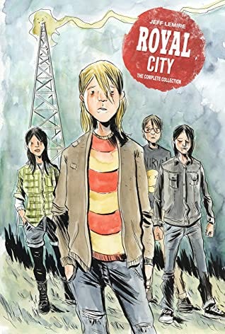
Royal City was the book I had done before starting Mazebook. That book was done in full color and I watercolored it all myself. In hindsight that was a big mistake. I love Royal City and, I’m really proud of that book, but it could have and should have been more. Writing a monthly book is its own challenge. Writing and drawing a monthly book is a huge undertaking. So with Royal City, writing, drawing, and coloring a monthly book nearly killed me. It wore me down and sucked all my creative energy. Energy I could have spent properly building that story was instead spent keeping up with the demand to do it all.
I’ll write in more detail about Royal City at a later date, but for now, and how this relates to Mazebook, what’s important to note is that I was looking for a way to have color in my next book without having to fully render it myself. I also didn’t want to hire a traditional comic book colorist. My illustrative work is so organic and spontaneous that I’ve come to realize that defining color is important in my storytelling process. I collaborated extensively with Jose Villarrubia on Sweet Tooth, but these days I want to control and create the artwork myself. I want it all to come from my hand.
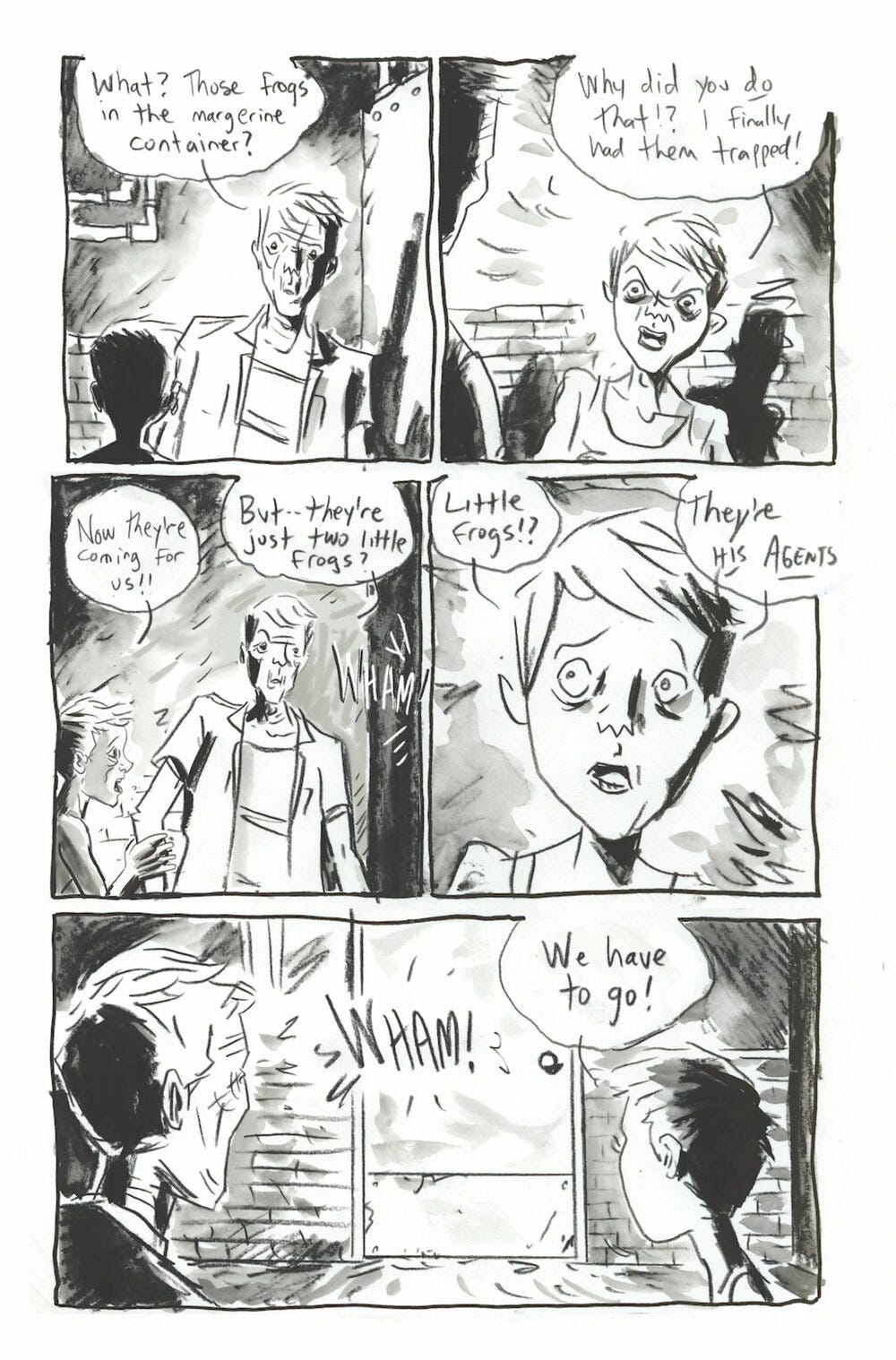
The other book of note in relation to Mazebook was my mini-graphic novel Frogcatchers from 2019. That book was done very very fast. That was the point of it. I needed to exorcise the labour intensive, time-consuming demons of Royal City and just create a story fast and loose. I did that whole book in pencil with loose ink washes. One element of that process that I really enjoyed was drawing my backgrounds in pencil rather than pen and ink. The soft pencil line allowed for the background to feel less rigid and a bit more organic, which was something I had long struggled with. So, for Mazebook, I ended up trying out a hybrid of various styles. I picked parts of different styles and methods I had employed in the past and merged them together into something that felt fresh to me each day at the drawing board. Sometimes I find it is the smallest adjustments that can reinvigorate you when drawing each day, from a new type of pen, to different ink or paper. These are the things that readers probably don’t even notice in the end, but they can make the act of drawing feel really new and fresh for me.
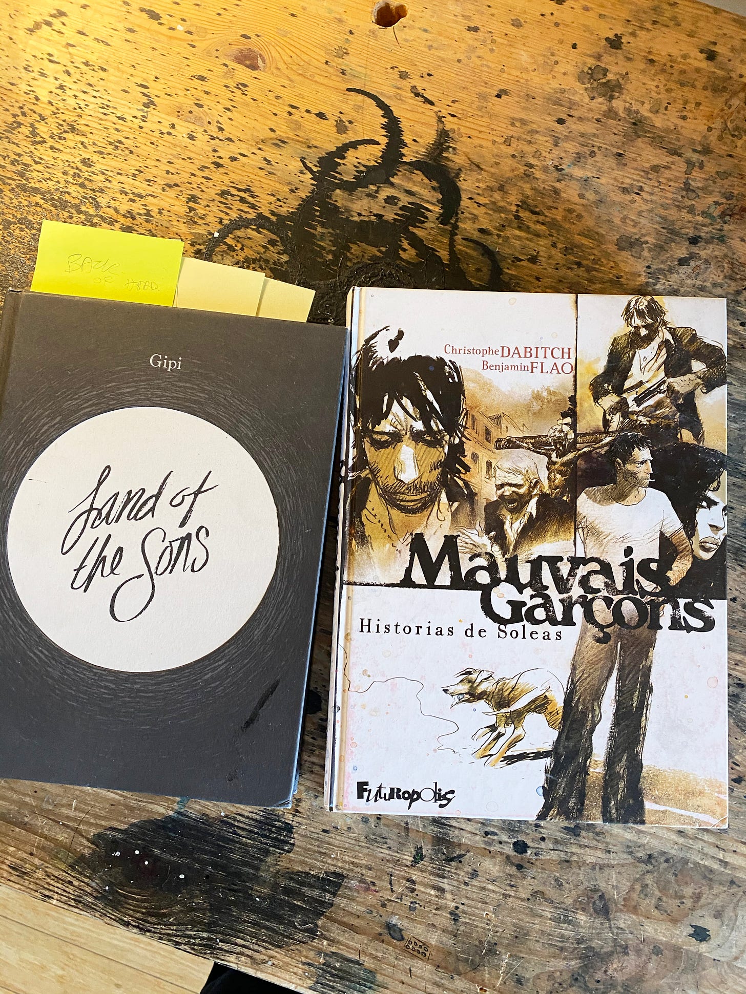
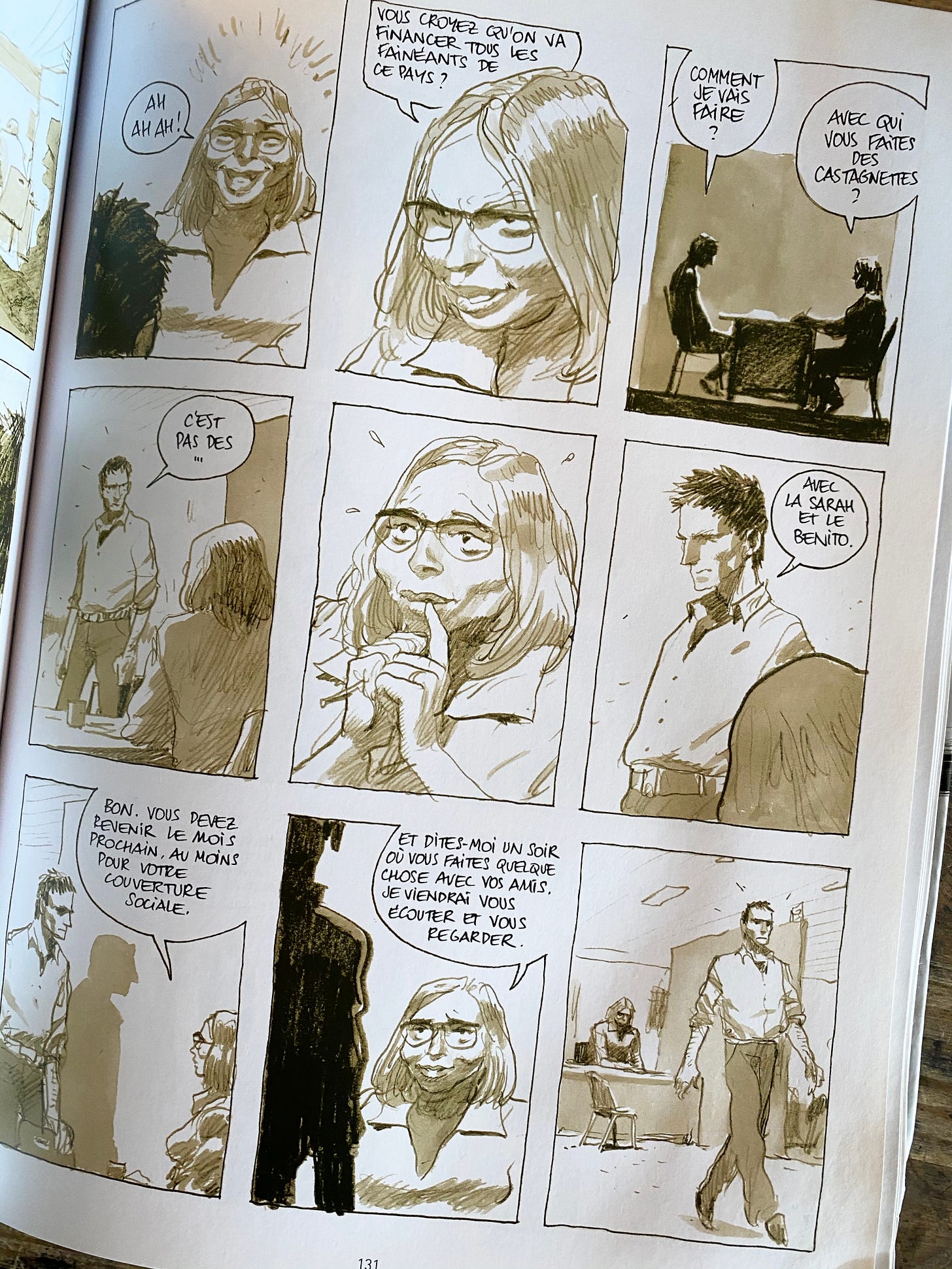
The two main external touchstones on the artwork for Mazebook were European cartoonists Gipi and Benjamin Flao. Their work has really impacted upon me over the last decade and their influence were really on my mind when working on Mazebook.
STEP-BY- STEP
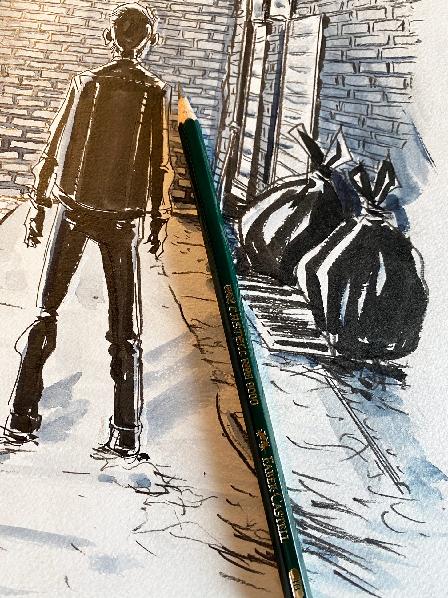
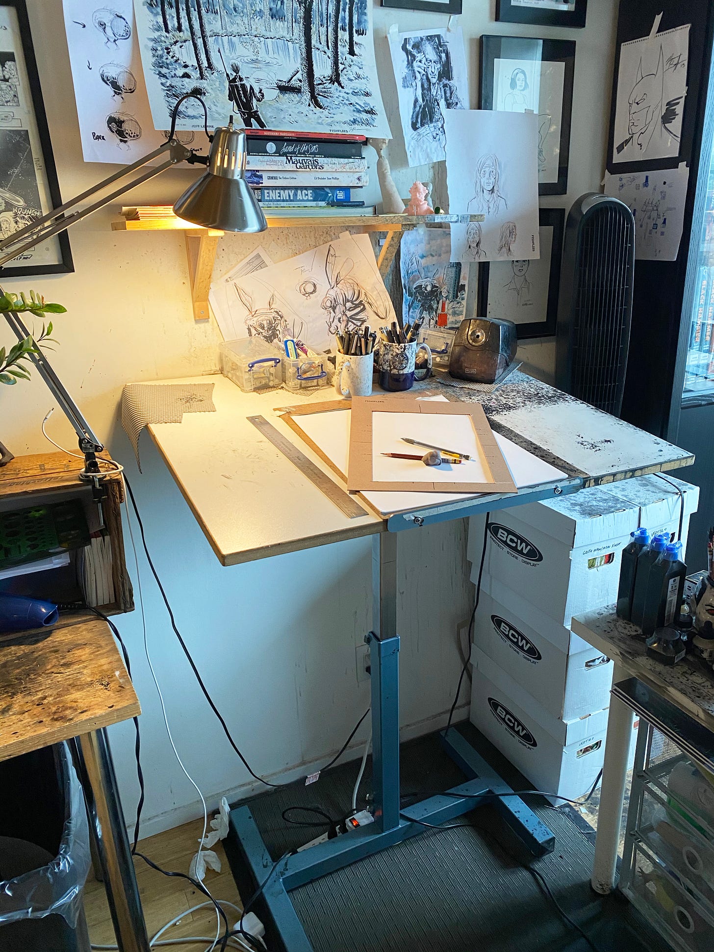
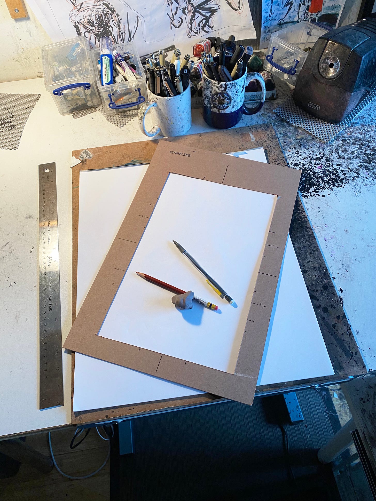
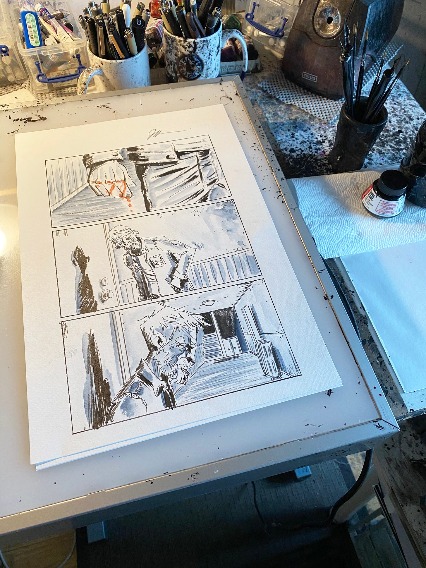
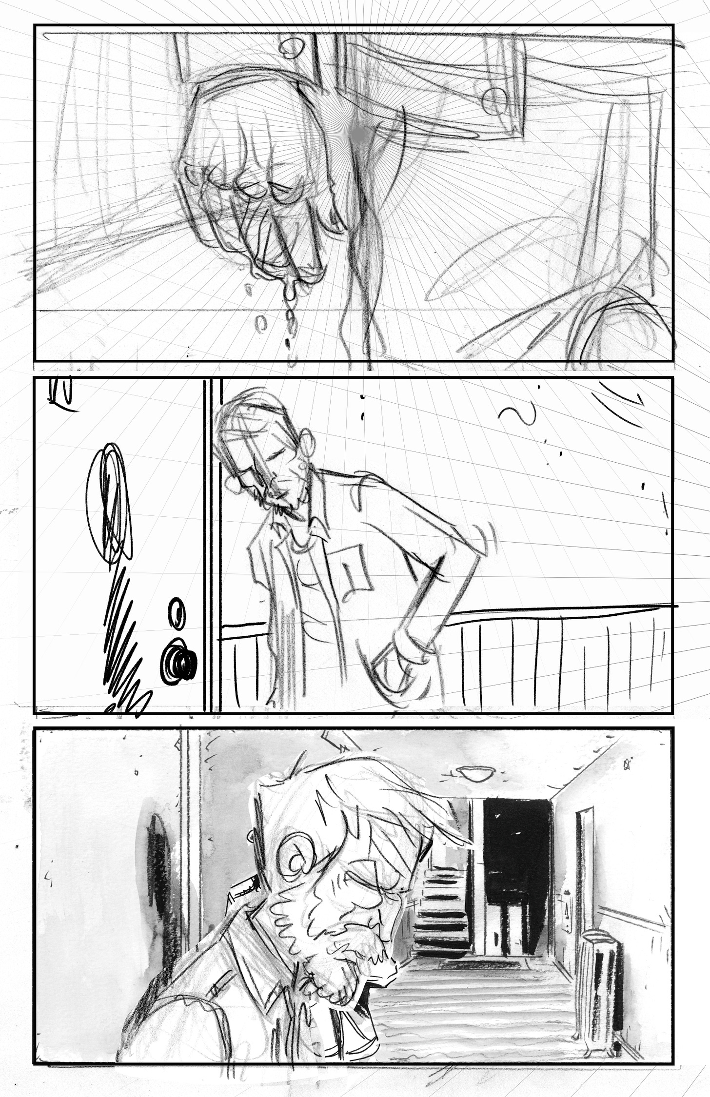
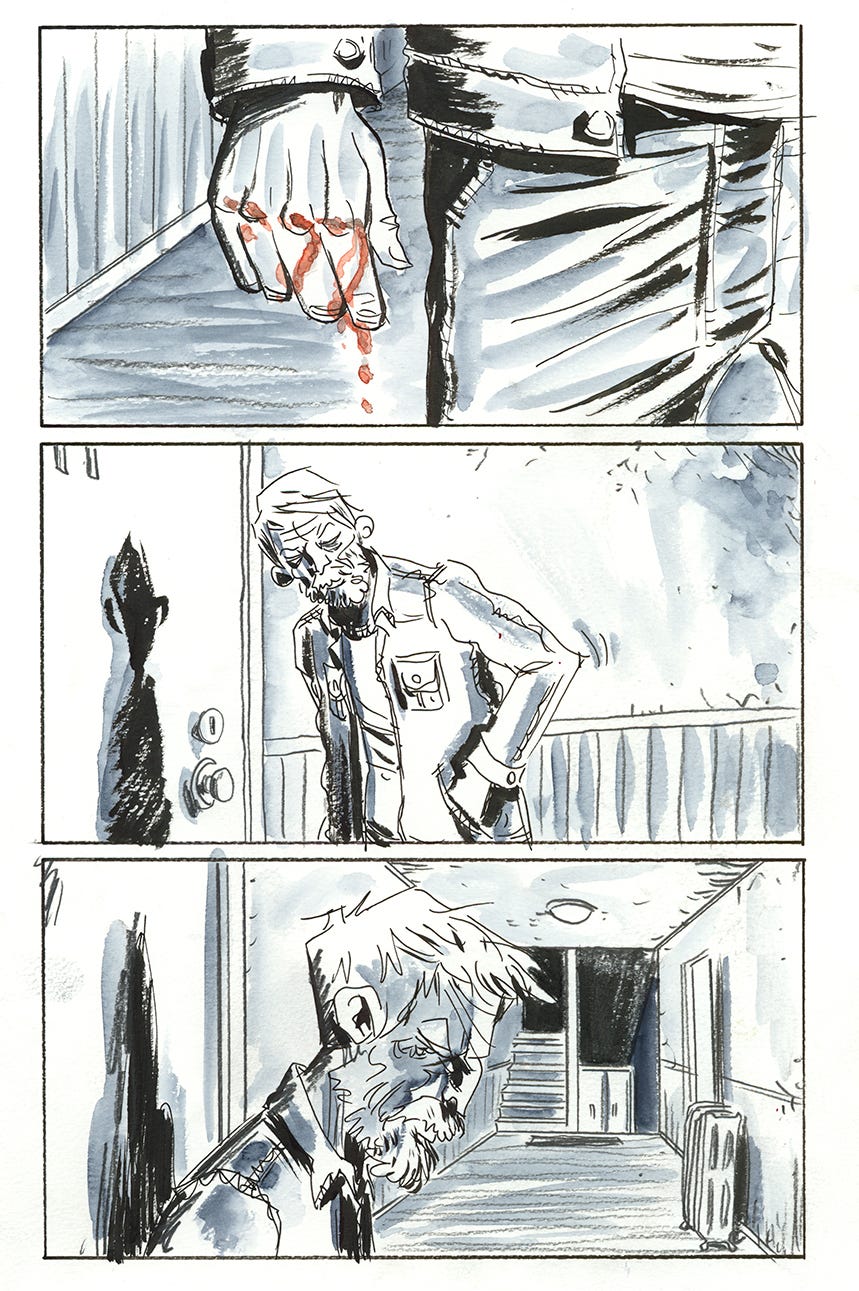
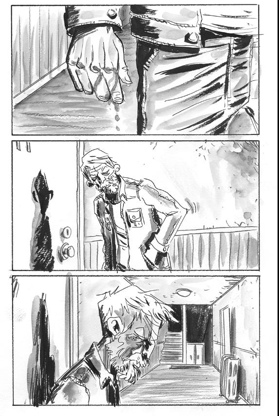
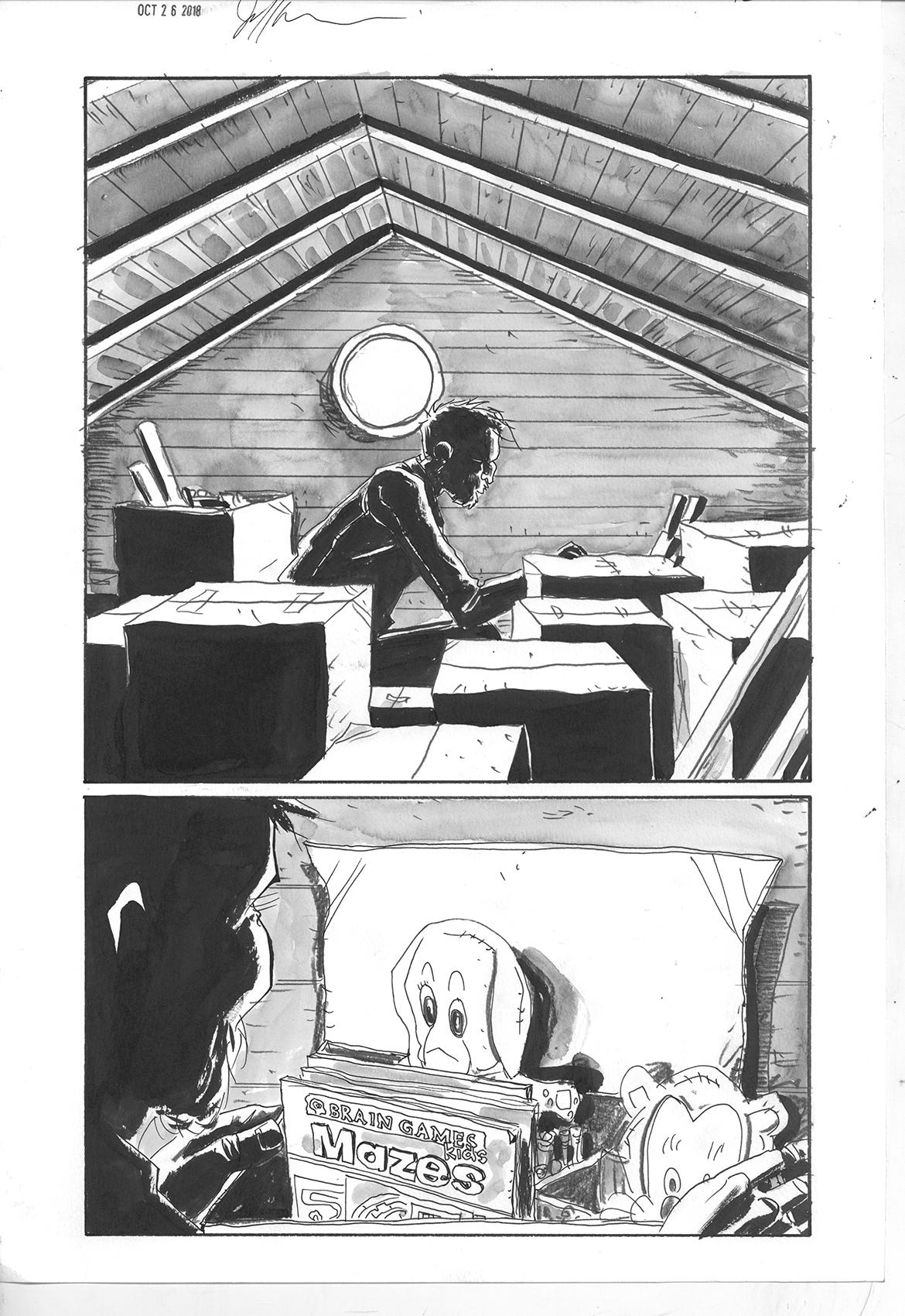
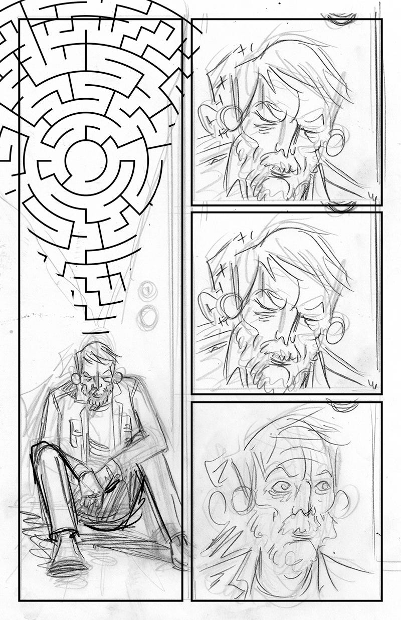
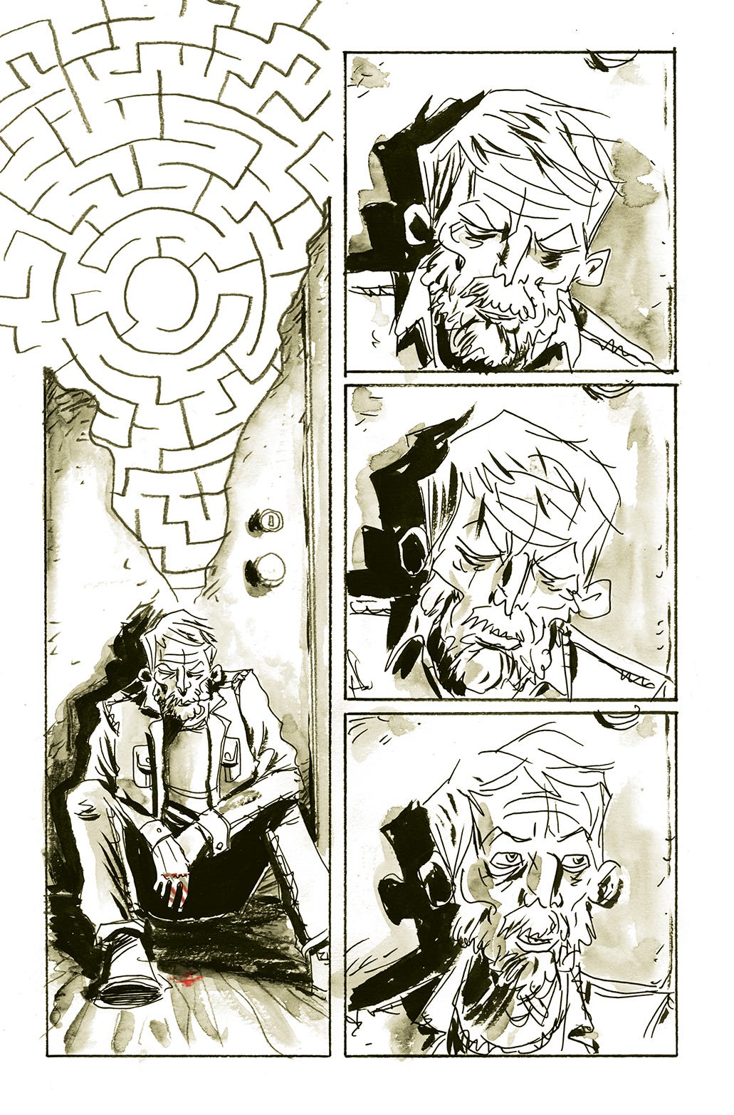
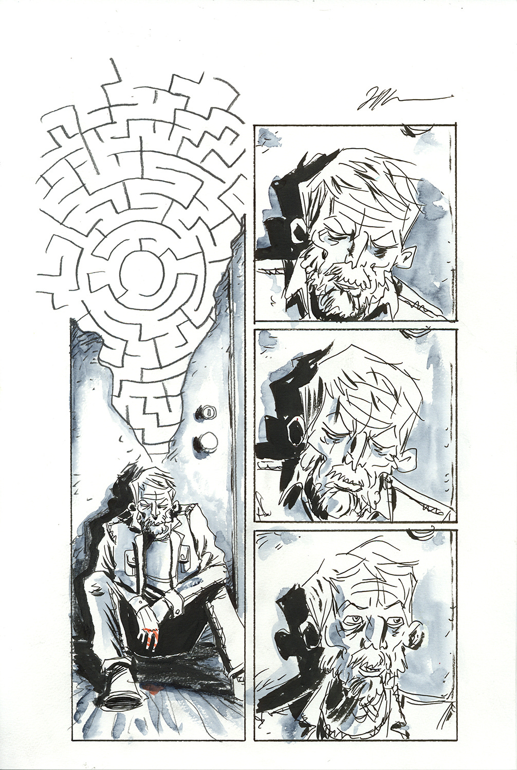
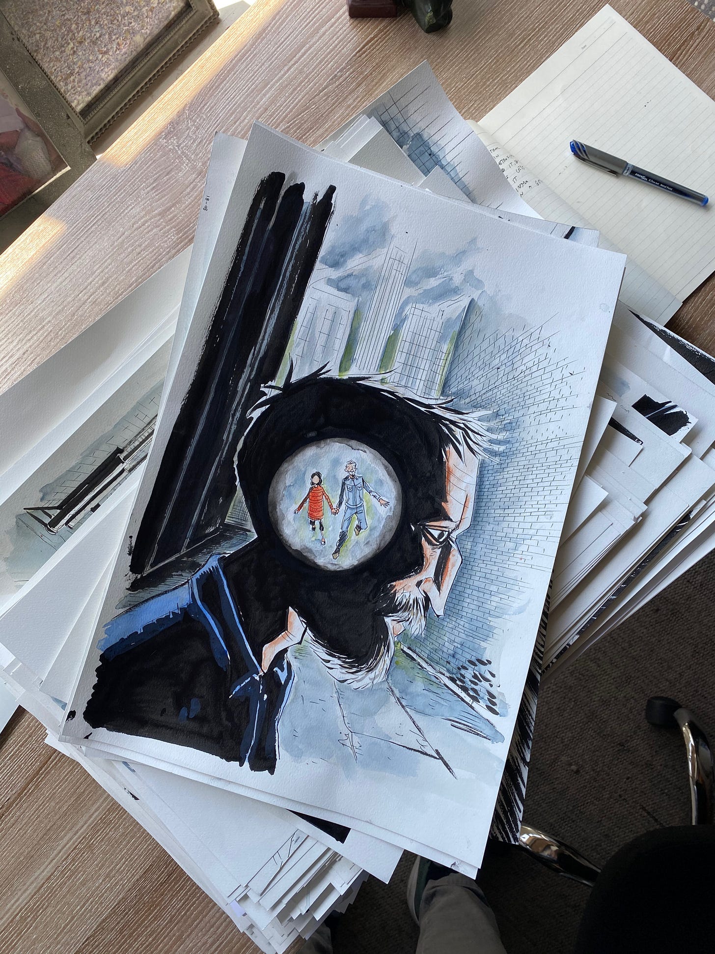
For Mazebook what I did was draw my characters, and the main elements of the panels in ink, and then draw my backgrounds with pencil. Then I watercolored over this with a blue paint I love called Paynes Grey. I’ve been using this same paint and color for years. It gives fantastic texture and moves on the paper really well. I drew the whole book on Canson 90lb Col Pressed Watercolor paper. The texture of the paper is great to work with and gives the ink a nice texture as well.
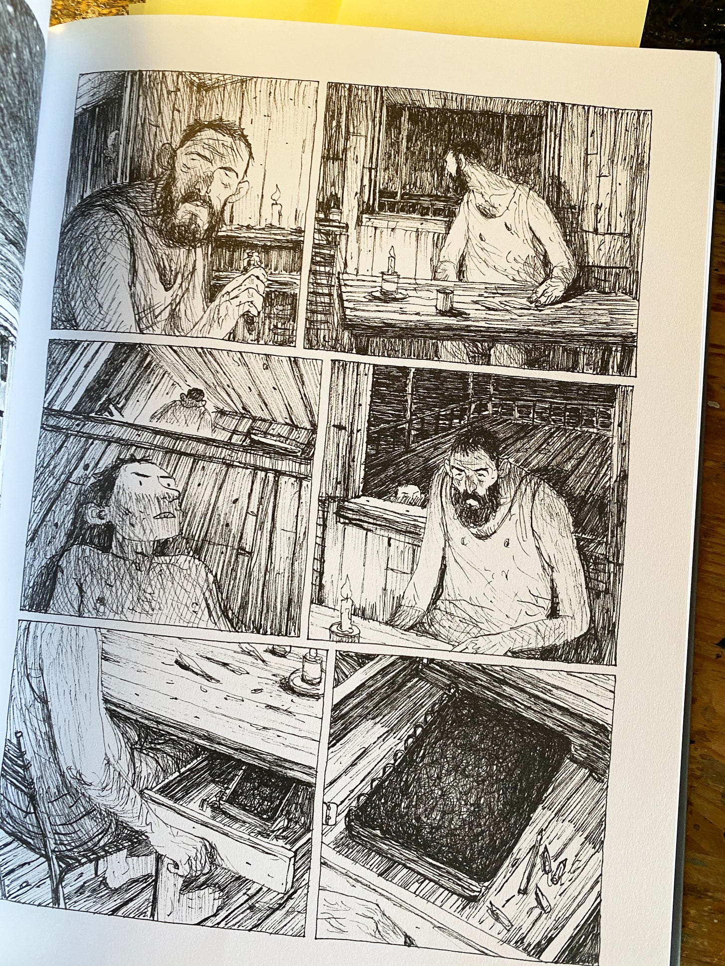
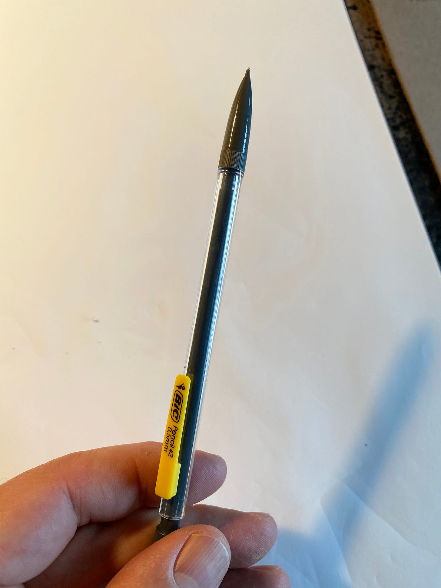
I tend to bounce back and forth between using nibs/crowquill dip pens for my inking and drawing with a simple Uniball fineliner pen. They each have advantages. The nibs give you all sorts of variety in your line-width, they are shaper, and can be very expressive. The pens have one consistent line width. The other thing I love about the Uniball pens is that you don’t have to stop to dip them in ink, so you can be very fluid with your lines without having to constantly stop and dip. Like I said each gives a slightly different look and quality to the art, so it really depends on which suits the tone and story better. For Mazebook I went with Uniball pens for all my linework, then brushes to do my blacks and accents. And then the backgrounds were all drawn with a 2B pencil.
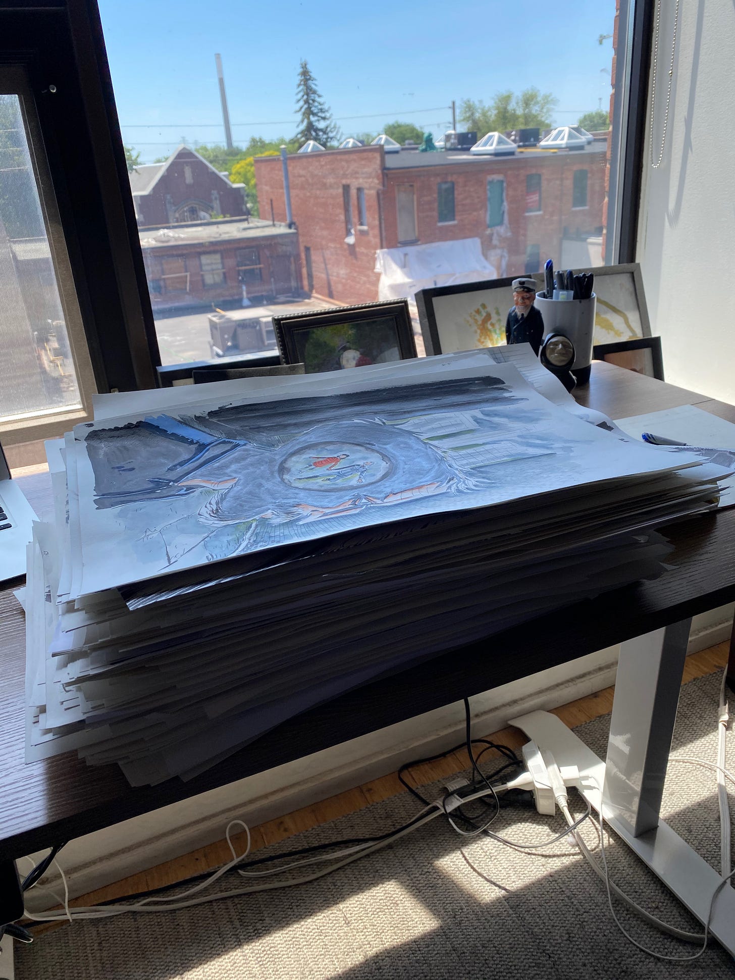
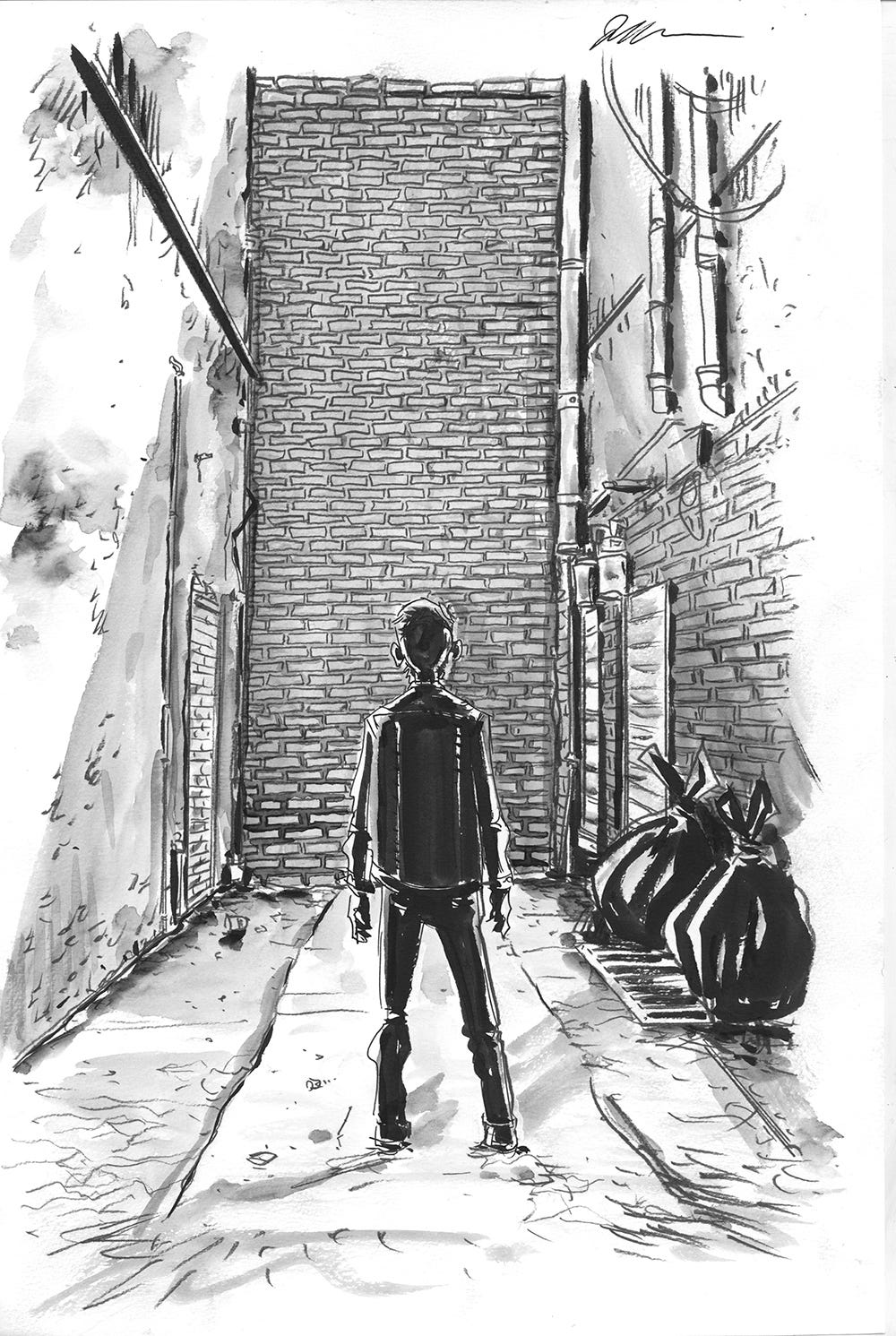
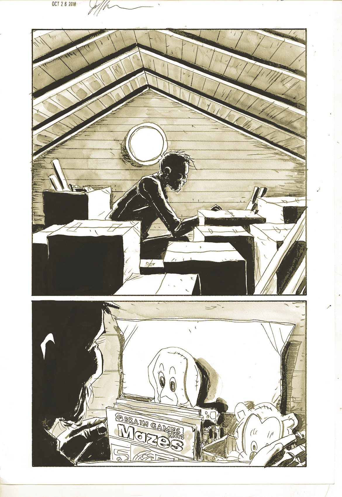
As you can see the original artwork for Mazebook, done with these tools, looks a lot different from the printed version. That’s because this was only the first step in achieving the look I was after…
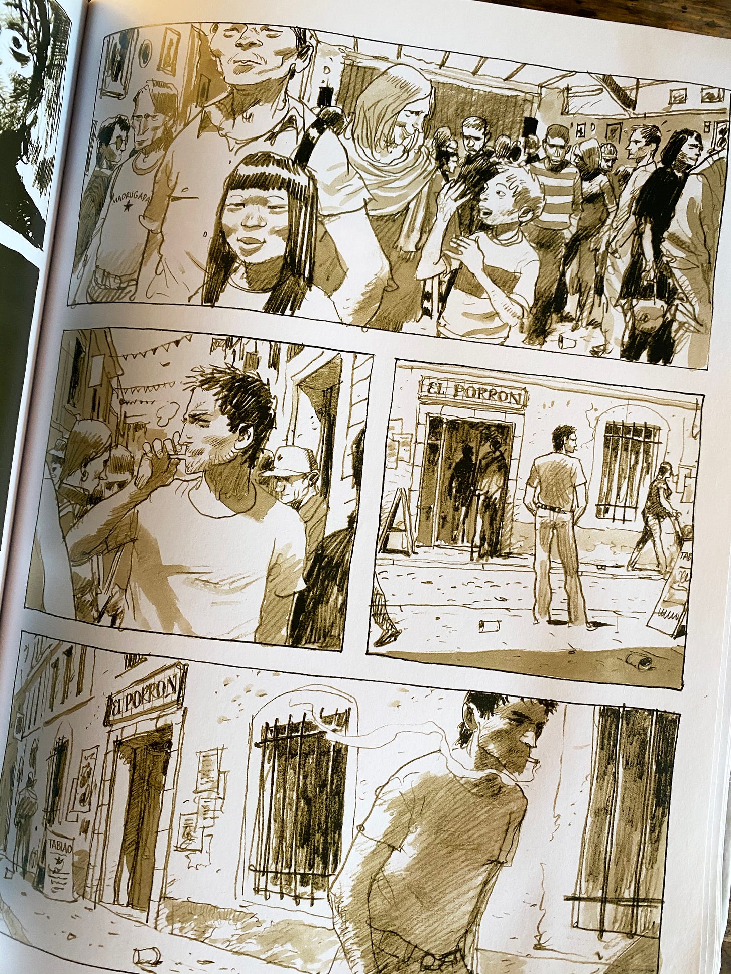
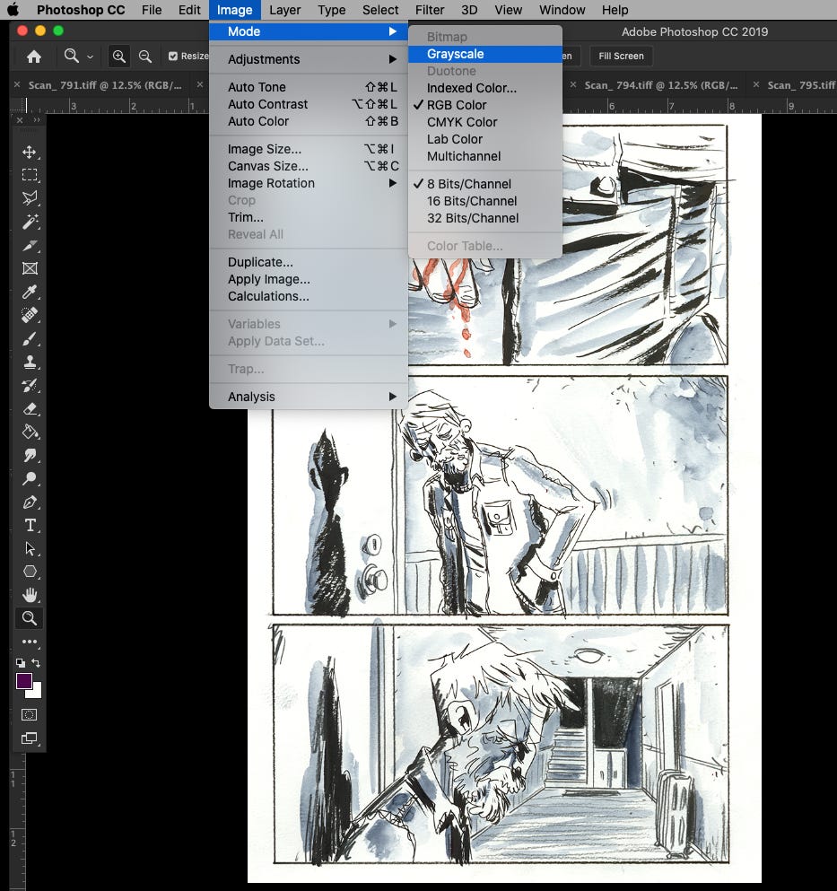
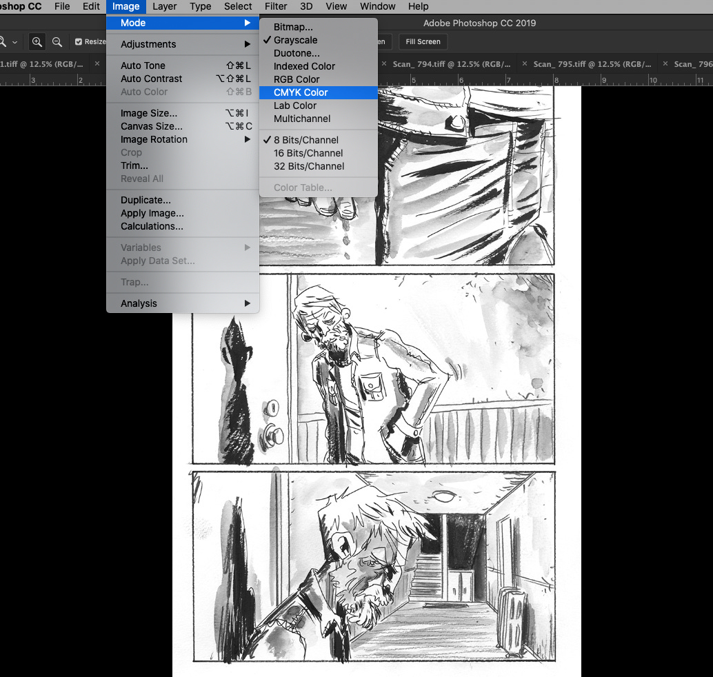
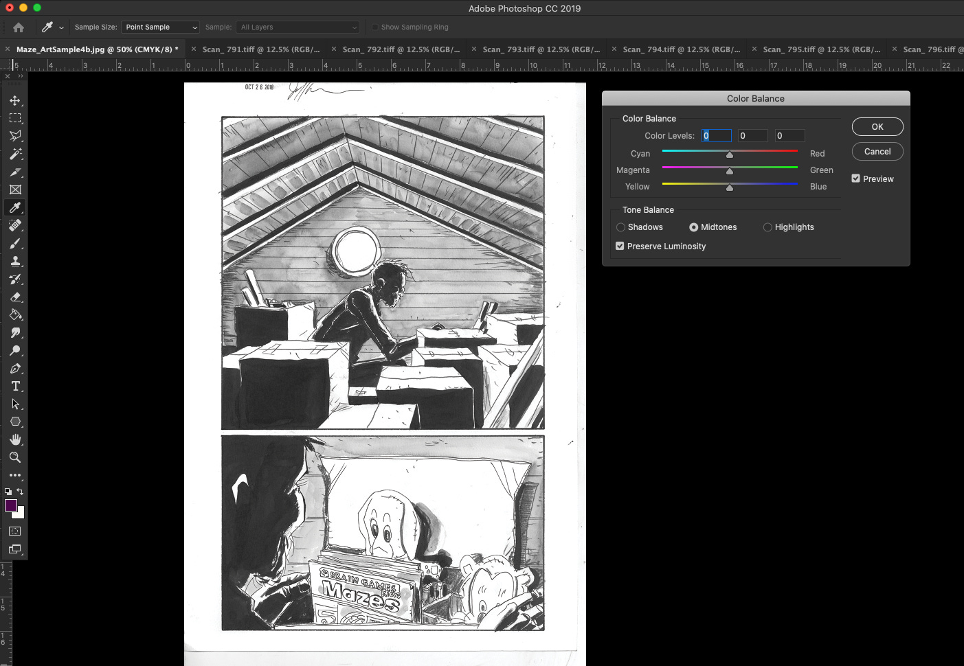
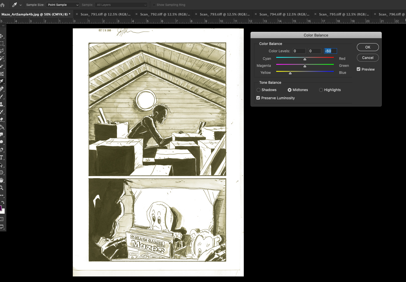
After drawing the pages I scan them in and this is where the next stage begins. After experimenting with different things in photoshop the look I settled on was achieved by first turning the artwork into black and white/greyscale. This makes the inked lines and the pencilled lines take on the same quality and color so that they don’t look so different from one another on the printed page.
Then I punch up the contrast of the drawings to pop the blacks and switch the image back to color in the CMYK setting.
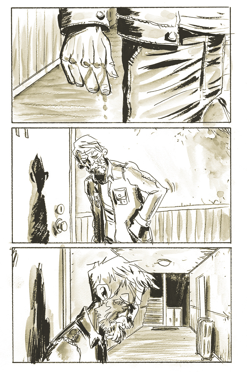
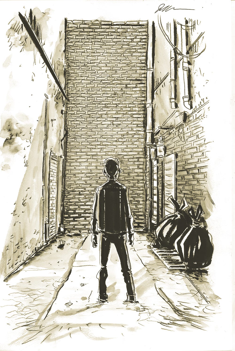
From there I play with the color balance and push the yellows way up to create this almost sepia-toned/yellow look to the whole thing.
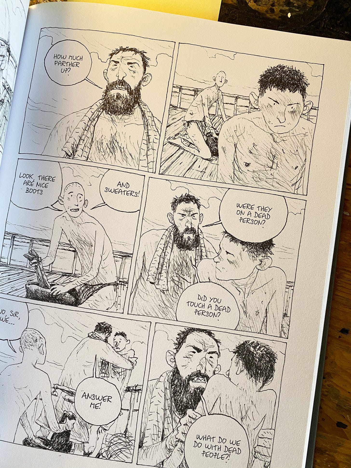
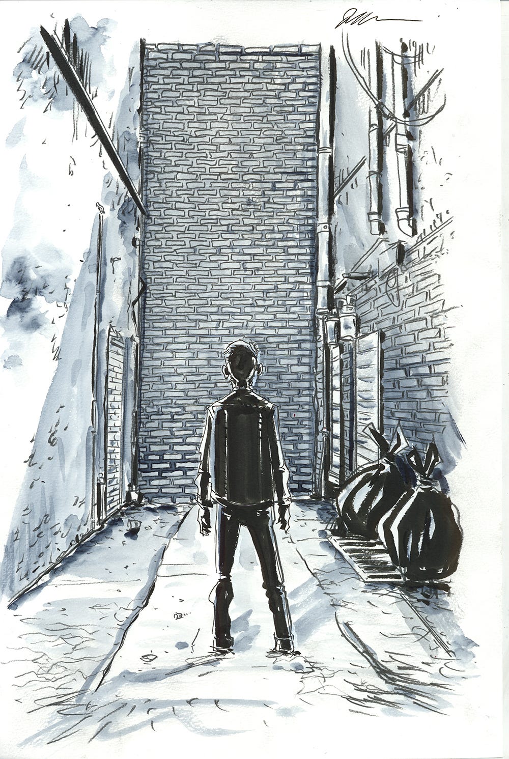
This is definitely the look I was after. It has a slightly dreamy, surreal veil over the whole thing that suits Will’s worldview completely. In later scenes and pages I will also have pages that are in blue rather than yellow. This was achieved the same way, but just by pumping up the cyan and blue in the color balance setting rather than yellow.
And some scenes, particularly the memories of Will’s daughter, were done in full color. This gave them a life. It made it feel like when Will still had his daughter he was more fully alive and now he is stuck behind this veil that he needs to break free from.
All-in-all I would say that the artwork in Mazebook is my personal favorite of all the books I’ve drawn. It is the closest to what I see in my head when I plan my stories. I often can’t look back on my books after I finish them, because all I see are mistakes and flaws. But I don’t feel that way with Mazebook. I just really like it. I like the art. That’s not how I usually feel when I finish a book.
More Mazebook next week when I get into the process of making the covers and show you some of the cover ideas that I tried before settling on the final look. – Jeff




This is awesome, thanks for this. I've always wondered what happened with Royal City. It seemed like it was building up for a longer run, and then all of a sudden the final issue was announced. After reading that first paragraph, though, it makes a lot of sense. Sounds like a hell of a grind for a monthly book.
Couple questions for the upcoming Q&A, if I'm not too late. Do you see yourself revisiting Royal City in the future at some point in a non-monthly format? And after looking at your desk, do you sit or stand when you draw? Or change it up?
Also, I feel like we're getting some Fishflies sneak peeks in some of these pictures, and I am intrigued!
Since the initial drawing/watercolors go through so many stages after being scanned in to become the final page that shows up in the book, which version would you sell as the original art page on cadence? Would it be the pre scanned in page with the actual lines/watercolors? Or a version that’s produced that is in the final book?